A long time ago, I was posed a series of CSS problems and exercises during an interview, the last of which sent me into a bit of a panic. Interviews are anxiety-inducing by themselves, but I was running out of time and it dawned on me how little practice I had with hand-coding CSS without looking up MDN or using frameworks.
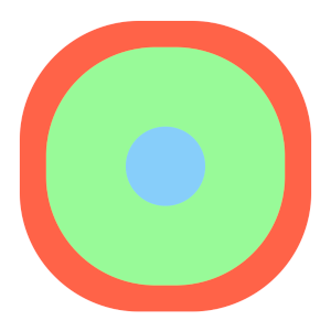
The exercise: Draw a set of 3 multi-color concentric circles.
Straightforward, right? Well, I fumbled big time. After moping around a bit and having calmed down, I tried again and found a simple solution. But the wretched exercise never left my head. Over the years, I’d learn nifty CSS features, and think “here’s another way I could have done it”. So here’s my attempt to get it all out and over with.
First pass
Let’s start with how a naive me did it. A series of nested div tags with relative positioning. Flexbox wasn’t yet widely supported back then, so it was all about position. The slightly tricky part was getting the top/left positions and the sizes of the circles right so that they appear concentric and not just nested along the top-left edge (thanks, box model).
<div class="container">  <div class="circle outer">      <div class="circle middle">          <div class="circle inner">          </div>      </div>  </div></div>
<style>  .circle {      border-radius: 50%;      position: relative;  }
  .outer {      width: 12rem;      height: 12rem;      background: tomato;  }
  .middle {      width: 10rem;      height: 10rem;      background: palegreen;      top: 1rem;      left: 1rem;  }
  .inner {      width: 8rem;      height: 8rem;      background: lightskyblue;      top: 1rem;      left: 1rem;  }88 collapsed lines
  body {      margin: 0;      padding: 0;      display: flex;      flex-direction: column;      align-items: center;      justify-content: center;      min-height: 100vh;  }  .container {      outline: 2px dashed rgba(0, 0, 0, 0.5);  }
  .circle {      opacity: 0;      animation-duration: 8s;      animation-iteration-count: infinite;  }
  .outer {      animation-name: outer;
  }
  .middle {      animation-name: middle;  }
  .inner {      animation-name: inner;  }
  @keyframes outer {
      0%,      100% {          opacity: 0;      }
      10%,      70% {          opacity: 1;      }
      85%,      95% {          opacity: 0;      }  }
  @keyframes middle {
      0%,      20%,      100% {          opacity: 0;      }
      30%,      70% {          opacity: 1;      }
      85%,      95% {          opacity: 0;      }  }
  @keyframes inner {
      0%,      40%,      100% {          opacity: 0;      }
      50%,      70% {          opacity: 1;      }
      85%,      95% {          opacity: 0;      }  }</style>
There is a direct relationship between the left/top offsets and the circle widths, expressed by this formula:
Width of inner circle = Width of outer circle - 2 * offset
So, if your outer circle was 100px, and your inner circle 80px, you’d have to make sure the top and left offsets were 10px.
The formula works because the offset centers the inner circle by dividing the total size difference evenly on all sides. Applying half of the size difference as the offset keeps the inner circle perfectly aligned within the outer circle.
Cool, so that’s one way to do it. But, what if you didn’t want a mess of nested HTML tags in your code that could potentially be difficult to read?
Enter pseudo-elements
With ::before and ::after, you could use fewer divs to accomplish the same thing, in almost the same way. A few things to note here:
- These are not nested one within the other—they’re at the same level. Which means you’d have to add
absolutepositioning to the pseudo-elements to make them stay concentric. This also messes with your offsets a bit—both inner circles need to be positioned relative to the base element. ::beforecomes, well, before::after, but not before the element itself in the stacking order—it comes before the content of your element. Both are children of your base element. While it may seem like::beforeought to be the outermost / bottom circle, your base element actually fills that role (barring anyz-indexshenanigans).
<div> ::before ::after</div><div class="container"> <div class="pseudo-circle"> </div></div><style> .pseudo-circle { width: 12rem; height: 12rem; border-radius: 50%; background: tomato; position: relative; }
.pseudo-circle::before { content: ''; width: 10rem; height: 10rem; border-radius: 50%; background: palegreen; position: absolute; top: 1rem; left: 1rem; }
.pseudo-circle::after { content: ''; width: 8rem; height: 8rem; border-radius: 50%; background: lightskyblue; position: absolute; top: 2rem; left: 2rem; }90 collapsed lines
body { margin: 0; padding: 0; display: flex; flex-direction: column; align-items: center; justify-content: center; min-height: 100vh; } .container { outline: 2px dashed rgba(0, 0, 0, 0.5); }
.pseudo-circle, .pseudo-circle::before, .pseudo-circle::after { opacity: 0; animation-duration: 8s; animation-iteration-count: infinite; }
.pseudo-circle { animation-name: outer; }
.pseudo-circle::before { animation-name: middle; }
.pseudo-circle::after { animation-name: inner; }
@keyframes outer {
0%, 100% { opacity: 0; }
10%, 70% { opacity: 1; }
85%, 95% { opacity: 0; } }
@keyframes middle {
0%, 20%, 100% { opacity: 0; }
30%, 70% { opacity: 1; }
85%, 95% { opacity: 0; } }
@keyframes inner {
0%, 40%, 100% { opacity: 0; }
50%, 70% { opacity: 1; }
85%, 95% { opacity: 0; } }</style>This results in more or less the same number of DOM elements in the end. And, you are kind of limited to 3 concentric circles per element this way. Unless…
Box Shadows
While box shadows are generally used to, well, cast shadows, they can also be used to make copies of your element, at various sizes! For our needs, we ignore the length values for x and y offsets and the blur radius, and focus on the spread radius (the fourth length value).
box-shadow: 0 0 0 10px red;What’s that? That’s just one circle, you say? You can layer more box-shadows! Just keep increasing the spread for bigger and bigger circles.
box-shadow: 0 0 0 10px red, 0 0 0 20px blue, 0 0 0 30px green;<div class="container"> <div class="shadow-circle"> </div></div>
<style> .shadow-circle { width: 8rem; height: 8rem; border-radius: 50%; background: lightskyblue; opacity: 0; box-shadow: 0 0 0 1rem palegreen, 0 0 0 2rem tomato; animation: shadow 8s infinite; }55 collapsed lines
body { margin: 0; padding: 0; display: flex; flex-direction: column; align-items: center; justify-content: center; min-height: 100vh; } .container { outline: 2px dashed rgba(0, 0, 0, 0.5); } html { margin: 0; padding: 0; }
@keyframes shadow {
0%, 100% { box-shadow: 0 0 0 1rem rgb(152, 251, 152, 0), 0 0 0 2rem rgb(255, 99, 71, 0); opacity: 0; }
20%, 70% { box-shadow: 0 0 0 1rem rgb(152, 251, 152, 0), 0 0 0 2rem rgb(255, 99, 71, 0); opacity: 1; }
40%, 70% { box-shadow: 0 0 0 1rem rgb(152, 251, 152, 1), 0 0 0 2rem rgb(255, 99, 71, 0); opacity: 1; }
60%, 70% { box-shadow: 0 0 0 1rem rgb(152, 251, 152, 1), 0 0 0 2rem rgb(255, 99, 71, 1); opacity: 1; }
85%, 95% { box-shadow: 0 0 0 1rem rgba(152, 251, 152, 0), 0 0 0 2rem rgba(255, 99, 71, 0); opacity: 0; } }</style>Something to note here: shadows, like in the physical world, do not occupy space. You will need to think about positioning offsets if you don’t want your shadows overlapping other elements or disappearing outside the browser window. Another potential problem is that once you hit a certain number of box shadows, performance begins to suffer, with all the painting the browser has to do.
One of the more annoying problems, in my view, is how certain browsers (Chrome) start distorting the shadows once they get past a certain size relative to your base element. The circular shadows start looking like rounded squares. This, apparently, is according to spec! More discussion about the relevant W3C spec here.
<div class="container">  <div class="shadow-circle">  </div></div><style>  .shadow-circle {      width: 6rem;      position: relative;      height: 6rem;      border-radius: 50%;      background: lightskyblue;      box-shadow: 0 0 0 6rem palegreen,          0 0 0 8rem tomato;      animation: shadow 8s infinite;  }28 collapsed lines
  body {      margin: 0;      padding: 0;      display: flex;      flex-direction: column;      align-items: center;      justify-content: center;      min-height: 100vh;  }  .container {      outline: 2px dashed rgba(0, 0, 0, 0.5);  }
   @keyframes shadow {
      0%,      100% {          box-shadow: 0 0 0 1rem palegreen,              0 0 0 2rem tomato;      }
      40%,      60% {          box-shadow: 0 0 0 6rem palegreen,              0 0 0 8rem tomato;      }  }</style>
One workaround to this is to bring in pseudo elements once again, making them close enough to the shadow size you need, and then adding box-shadow to the pseudo elements. Feels like overkill… What else can we do?
Radial Gradients to the rescue
Radial gradients are so cool. I see this approach as kind of the inverse of the box shadow approach—instead of starting with the innermost circle and adding shadows that expand outward (although, there are inner box shadows too), you start with one circle and add gradients that make it seem like there are more circles within. You need to be mindful of the color stops in your gradient setup so that there’s no blending involved—just hard stops from one circle’s edge to the next.
background: radial-gradient(circle at center, blue 50px, red 50px)<div class="container"> <div class="gradient-circle"></div></div><style> .gradient-circle { width: 12rem; height: 12rem; border-radius: 50%; background: radial-gradient( circle at center, lightskyblue 4rem, palegreen 4rem, palegreen 5rem, tomato 5rem); position: relative; }13 collapsed lines
body { margin: 0; padding: 0; display: flex; flex-direction: column; align-items: center; justify-content: center; min-height: 100vh; } .container { outline: 2px dashed rgba(0, 0, 0, 0.5); }</style>And just like box shadows, you can layer multiple radial gradients, with the added bonus of not having to worry about overlapping other elements or the distortion problem.
Some things to consider
Why would you pick one of these approaches over the other? Maybe you want to animate one or more circles independent of the rest. While transform can animate individual DOM elements buttery smooth with interpolation, animating certain types of changing backgrounds is not as fluid, causing stutters.
<div class="container">  <div class="circle outer tone rotate">      <div class="circle middle tone rotate">          <div class="circle inner tone rotate">          </div>      </div>  </div></div><div class="container">  <div class="circle outer">      <div class="circle middle">          <div class="circle inner pulse">          </div>      </div>  </div></div><div class="container">  <div class="gradient-circle pulse-gradient">  </div></div><style>  .circle {      border-radius: 50%;      position: relative;      display: flex;      justify-content: center;      align-items: center;  }
  .outer {      width: 12rem;      height: 12rem;      background: tomato;      &.tone {          background: linear-gradient(90deg,                  tomato 50%,                  #ff9980 50%);      }  }
  .middle {      width: 10rem;      height: 10rem;      background: palegreen;      &.tone {          background: linear-gradient(90deg,                  palegreen 50%,                  #c1ffc1 50%);      }  }
  .inner {      width: 8rem;      height: 8rem;      background: lightskyblue;      &.tone {          background: linear-gradient(90deg,                  lightskyblue 50%,                  #b0e2ff 50%);      }  }
  .gradient-circle {      width: 12rem;      height: 12rem;      border-radius: 50%;      background: radial-gradient(              circle at center,              lightskyblue 4rem,              palegreen 4rem,              palegreen 5rem,              tomato 5rem);      position: relative;  }
  .rotate {      animation: rotate-clockwise      8s linear infinite;  }
  .rotate:odd {      animation: rotate-counterclockwise       8s linear infinite;  }
  .pulse {      animation: pulse 2s infinite;  }
  .pulse-gradient {      animation: pulse-gradient 2s infinite;  }
  @keyframes rotate-clockwise {      from {          transform: rotate(0deg);      }
      to {          transform: rotate(360deg);      }  }
  @keyframes rotate-counterclockwise {      from {          transform: rotate(0deg);      }
      to {          transform: rotate(-360deg);      }  }
  @keyframes pulse {      0% {          transform: scale(0.95);      }
      50% {          transform: scale(1.1);      }
      100% {          transform: scale(0.95);      }  }
  @keyframes pulse-gradient {      0% {          background: radial-gradient(                  circle at center,                  lightskyblue 4rem,                  palegreen 4rem,                  palegreen 5rem,                  tomato 5rem);      }
      50% {          background: radial-gradient(                  circle at center,                  lightskyblue 4.5rem,                  palegreen 4rem,                  palegreen 5rem,                  tomato 5rem);      }
      100% {          background: radial-gradient(                  circle at center,                  lightskyblue 4rem,                  palegreen 4rem,                  palegreen 5rem,                  tomato 5rem);      }  }
  body {      margin: 0;      padding: 0;      display: flex;      flex-direction: column;      align-items: center;      justify-content: center;      min-height: 100vh;      gap: 0.5rem;  }</style>
Keen-eyed readers might have noticed that I didn’t animate the earlier radial gradient example, for this exact reason. Using radial-gradient() results in an object of the gradient data type, which is a special kind of image. So in effect, we are using the background-image property, which, while animatable, will be annoying to make smooth—there is no interpolation between color stops. It just switches from one to the next. Great if you like stop-motion animation!
You could code up 24, or 60, or even 144 steps of @keyframes to try to make it smooth, but you’re going to have inconsistencies across displays depending on refresh rates. And who wants to write all that up anyway! (AI, probably).
You might also want to add more styles to each circle, such as a border. That would complicate the circle math in the nested div example but not by much. Both box shadows and radial gradients make it easy - you just add more layers / color stops.
Other ways
There are many more ways to do this, including using CSS Grid, SVGs, the Canvas API, perhaps even getting fancy with clip-path and mask-image and the like. I’ve yet to explore each of them enough to write about. Perhaps one day, if I’m still thinking about that damn interview question.